What makes a great tap handle?
Posted by Richard Gendron on 2022 Mar 29th
What makes a great tap handle?

A great tap handle should be visually appealing, functional, and easy to use. Here are some specific factors that can make a tap handle stand out:
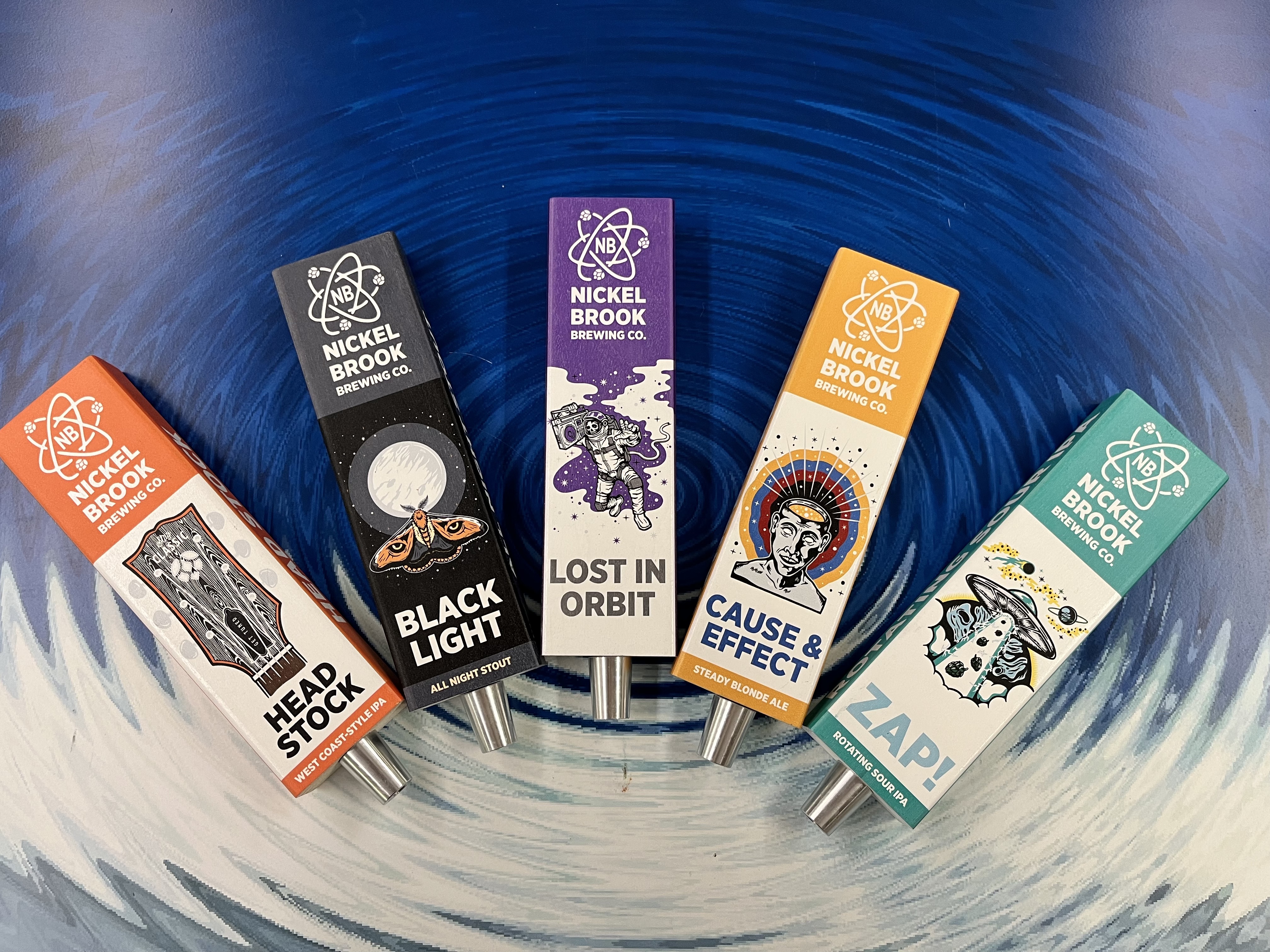
Tap handles are advertising; plain and simple. Does the gargoyle or unicorn attract more attention than a simplistic Bud Light handle? Artistic designs can be striking and attention-getting, but...
Art is not advertising. When a museum is advertising an art exhibit, do they just throw up a big painting on the outside of the building and expect people to come? NO, they use engaging text, colour and composition. The art is in the background, if there at all.
When we design handles we have advertising in mind first.
- Where is this handle going? Possibly in a poorly lit pub. We need it to be bright and have contrast.
- Who is your customer? Usually someone looking for something new but doesn’t want to waste $8 on a pint that they are going to hate. Most people like to stick to the types of beer they love, so if it says that on the handle, they will order it. (Make mine a Hefeweizen, or any Belgian Wit please!)

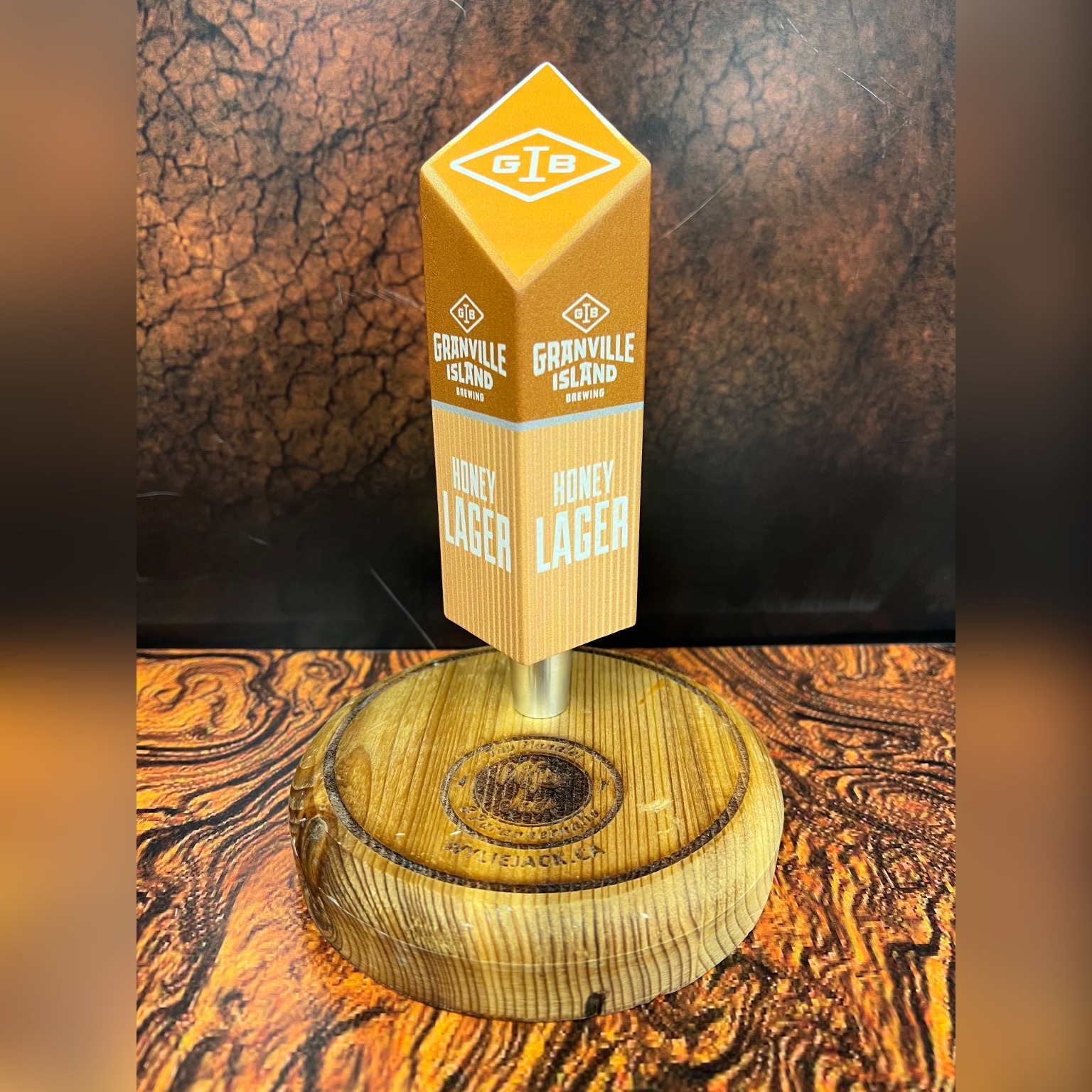
Make the handle easy to read and have all the information legible to make that decision:
1. Company name/logo
2. Type of beer
3. Where is it made.
- Does it follow your existing branding? Example: I went to the store and purchased a 6-pack of Jim’s Lager as I want to try something new on a Friday night. I loved them, and now I am off to the local pub.
- Can I make that connection between the packaging, the cans and the tap handle? Sometimes I can’t because Jim’s Lager decided to use a unicorn rather than make a design that directly related to his branding.
A tap handle is no different than any other part of your branding. It has to be consistent. We want to generate impressions, otherwise what is the point?

Let's look at Budweiser for example: InBev spends plenty on branding and research. When looking at an InBev tap handle, they are simple, to the point, no nonsense advertisements. They stand out. Rich colours, bold text, clean lines. That equates to brand recognition and customer loyalty.
For that guy who is trying to make a decision on what to spend his $8 on, he is going to go with what he’s familiar with. Something he’s seen or tasted before, something that’s memorable. The goal of advertising is to get as many impressions on your customer as possible. The more you get, the more likely you and your company are to switch him from the competition; the more likely he is to take that first sip. He needs to feel comfortable giving you that hard earned $8. The only way to do that is through consistent, insightful repetition. Once you achieve that you will have a customer for life.

